PERT Chart
A pert chart is used in project management as a tool to define and coordinate tasks and timelines. PERT stands for Program/Project Evaluation and Review Technique.

In this article we will show you what a PERT chart is, how it is used and how you can use it yourself. At the end of this article, you can also find PERT chart templates to help you implement this technique in your own project management.
Table of contents
What is a PERT chart?
A PERT chart enables you to visually represent a project’s timeline and the tasks that are necessary to complete the project. It is therefore widely used in the fields of project and product management. With this technique, you can not only schedule project tasks but also organize and coordinate them. It enables project managers to identify which tasks can be shortened in order to save time but also pinpoint critical tasks and take those into account. The information about the duration of the task helps managers to determine the time required to accomplish and implement a project. This further helps to define the required resources, like budget and personnel. The main goal of a PERT chart, therefore, is to reinforce the decision-making progress and to calculate and reduce the costs and time of a project.
Besides that, PERT includes information about different departments and therefore connects the responsible stakeholders across the company. PERT can also help improving the communication during the project. Therefore, PERT helps to determine the most efficient way to a successful project.
It also brings its disadvantages. Largely project managers use PERT charts for extensive and complex projects with interdependent tasks. It is likely to be subjective and can contain an unreliable time and cost estimation. It, therefore, depends on the experience the conductor brings with them. The focus purely on the deadline can also be disadvantageous.
What is a PERT chart used for?
- Visualizing a projects tasks and timelines
- Organizing and coordinating tasks
- Defining a time frame for the realization of a project
- Identifying less complex but also time-consuming tasks
- Determining required resources and budget
- Reinforcing decision-making progress
- Complex projects that occur irregularly and have a high interdependency

Free Word-Template Download
Download our 100% customisable .docx MS-Office Template for free with just one click. No contact details required.
Download Free TemplateThe difference between a Gantt chart and a PERT chart
Next to the PERT chart, a very frequently used visualization of tasks is the Gantt chart. This tool also helps in scheduling, organizing, and coordinating tasks. So, if both basically allow you to do the same thing, what is the difference between them?
First of all, the most obvious difference is the form. While Grantt charts always come in the shape of a bar graph, PERT charts are apart from the nodes and arrows free form.
Moreover, in contrast to the Gantt chart, the PERT chart allows you to identify task dependencies. In the Gantt chart, each bar stands for itself whereas the PERT shows dependence through directional arrows.
What is an example for a PERT chart?
As we now know, a PERT is a visual tool. So let’s take a closer look at the visualization of this technique and what an example can look like.
A PERT chart consists of circles or rectangles (called nodes) that are linked by lines or arrows. The nodes represent project milestones whereas the arrows symbolize tasks. Tasks can be dependent or directional, which means they have to be fulfilled in a specific order. If there is more than one line or arrow it is referred to as parallel or divergent tasks. They don’t interrelate but can be performed simultaneously or in a sequence.
So much for the theory, now let’s take a look at an example.
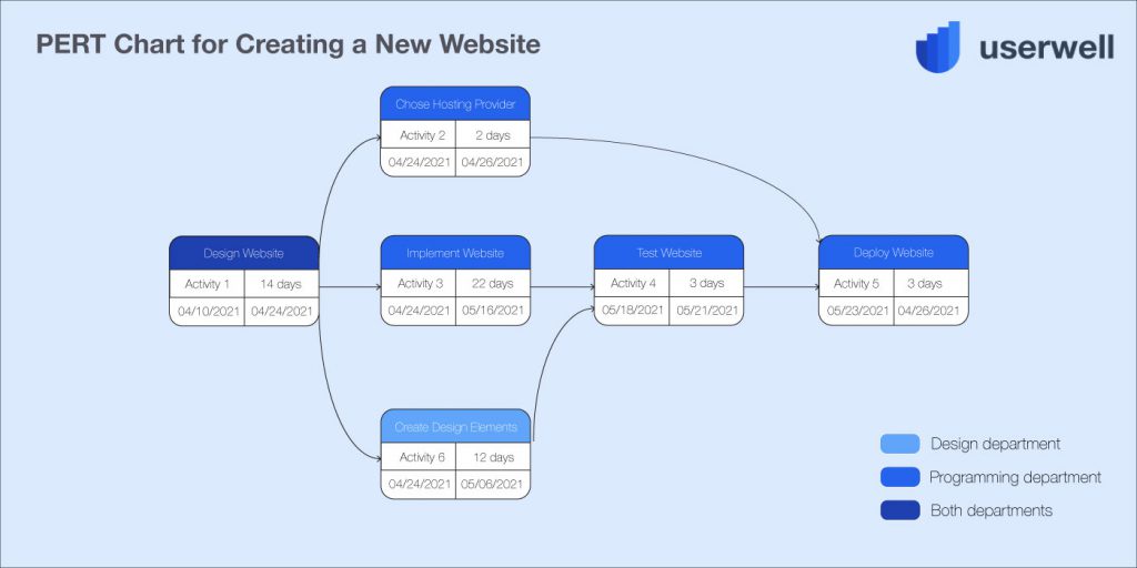
Creating a new website: Our company wants to build a website for the new product line. The PERT chart we create shows the tasks and timeline we need to complete this project, from designing to deploying it.
How you can make your own PERT chart
After we gained an understanding of what a PERT chart is, what it is used for, and what it looks like, we can now start building our own PERT.
Here is an easy step-by-step guide on making a this chart:
- Step 1: Pinpoint the activities of your project and derive tasks.
- Step 2: Define the order of your tasks. Determine their dependencies and establish the responsible department/team.
- Step 3: Create the diagram. As a starting point you can use the PERT chart template below and complement it, so it suits your project. Use the in step 1 defined milestones put them into the nodes. Then assign the tasks that have to be completed between each milestone, using directional or parallel arrows.
- Step 4: Define a time frame for the tasks and estimate what tasks are more time consuming and which might cut you a little slack.
- Step 5: Keep the chart up to date during the ongoing project.
Following these five steps, you can now create your own PERT chart. To help you start we create a few downloadable templates below and refine them for your purpose in order to optimize your project management.